
Charlotte Cotton: I wanted to start with asking you to recap how you got involved with the ICP Museum project and your brief to design the graphic identity of both the space and the opening exhibition, Public, Private, Secret.
Geoff Han: I was introduced to the project through Common Room, who were selected to be the spatial designers of the ICP Museum’s front space and the first exhibition. I’ve collaborated with Common Room for eight years now. Our collaboration started off with making publications together and grew to include a larger scope of work, including visual identity, website, and exhibition-design work. Common Room asked me to submit together with them for the ICP Museum.
CC: I obviously remember your first proposal document and how strong it was in terms not only of showing your and Common Room’s demonstrated capacities but also in your understanding of ICP’s project. I think that one of the defining features of this kind of complex design project is to stay focused on the core concept developed in its first stages. Can you remember the core brief for the ICP Museum?
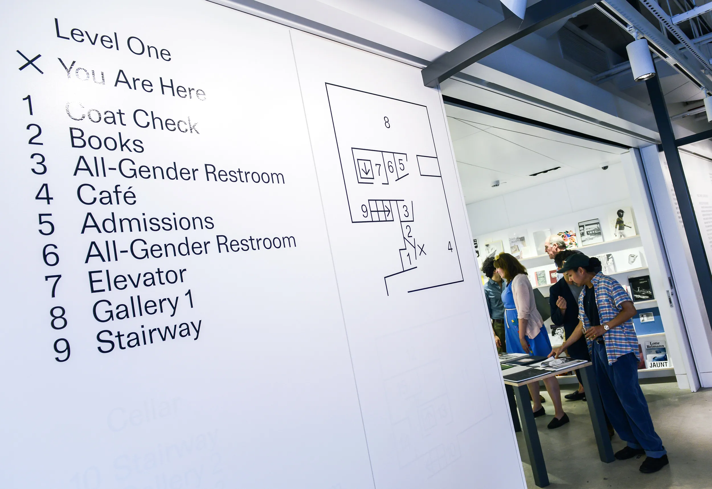
GH: We were presented with quite a complicated brief and I think a lot of the design that we employed—both spatially and graphically—was about clarifying and simplifying the brief. On the one hand, there was a predesigned architectural space by SOM, and on the other, there was a very condensed budget and tight schedule. But I think we are used to dealing with restrictive briefs so it wasn’t a shock or a stumbling block for us. Very often, we like to come up with something specific to these conditions. For example, with the signage and wayfinding, we worked exclusively with vinyl lettering to explore how this low-cost and basic graphic material could be exhausted in different ways.
CC: And most obviously that plays out in the use of white vinyl alongside black vinyl for wayfinding and informational texts. There are a number of instances where you are standing in front of text and what you need to read in that location is in black vinyl and what is additional—either letting you know about something that will happen in the future or is positioned within another location in the museum—is in white vinyl. Like the design of the exhibition, it’s very thoughtful regarding the physical presence and the moment in time of visitors coming to the ICP Museum.
GH: I guess the white and black vinyl play out in a number of ways and we described them in one of our proposal documents as “performative gestures.” Sometimes the white vinyl is used to mark a different location from where you are when reading the text, or sometimes it is used to mark something upcoming. And we also liked the idea that the vinyl will need to be removed and replaced over time. We were interested in using vinyl in a way that I don’t think I’ve seen used before. The most difficult part of the job was to convince you and everyone at ICP that this could be possible. For an institution of ICP’s scale, it was an issue of concern to render information on the border of legibility.
CC: But you proved to ICP that there were numerous contemporary precedents of museums creating these “performative” scales of legibility, in its wayfinding at least. And also set a benchmark that we wanted to achieve throughout the ICP Museum’s spatial design, that it has a real thoughtfulness to it and a consideration of how visitors will move through the space, and what is the most useful information to provide at each stage of the route. One of the things I remembering discussing with you and Common Room was wanting the space to communicate very directly with visitors and not be impeded by an overt branding design or institutional voice, and the temporality that you put into the graphic design really helps with the direct experience we wanted to achieve.
GH: Another important aspect of the project was research into the ICP’s archive—back to its very beginning, when it was called the Fund for Concerned Photography. There was a range of printed matter for the ICP in its first years and much of it used an old lead typeface called “Permanent,” a sans-serif typeface that is subtly unique. One of the first things that I wanted to do was try to have it digitized and become a font specifically for the ICP Museum. As with other aspects of the visual identity of the museum, it’s very subtle, but there is a hidden story behind its meaning. I worked with a Laurenz Brunner—a very successful Swiss type and graphic designer—to create the font in a very short period of time.
CC: Forgive my ignorance but what is the difference between a typeface and a font?!

GH: A font is a digital version, a file of an analog, materialized typeface. So what you see on the wall is a typeface and what you use on your computer is a font, something that is not yet materialized. What we are using here is a font that is drawn from scratch on the computer in a font-design program. Laurenz referenced the ICP archive material, which I scanned and emailed over to him, and then drew out the font. At the moment, only ICP is using this customized font called “Permanent.”
CC: It’s a lovely analogy as a whole for our aims at the ICP Museum, which is to bring the ICP’s heritage and history of types of engagement and communication into the present.
GH: Yes, definitely. And the final parts of the process were to incorporate the visual identity into Common Room’s spatial identity and think about the implications for the exhibition’s graphic design.
CC: One of the obvious observations about the relationship between the graphic and spatial design is that the graphics are big!
GH: To be honest, I actually forget how big it appears to other people. I look around now and think that there could have been more graphic signage than was implemented. In general, it’s a very straightforward approach in that the information that the space needs to communicate—wayfinding, information about works on display, and the live-events program—acts as the graphic identity of the space. This approach deals with information as plainly as possible and presents it at quite a legible scale—the information becomes the identity. The visual identity attempts to balance the spatial design as well.
CC: And I think, to some degree, it reflects the flattening of hierarchies that is going on here during Public, Private, Secret, where the live-events program has parity with the exhibition, and the historical photographs on display are treated in the same way as contemporary artworks. And to treat the graphics in the same way—whereby information on where to find the coat check is just as important as finding out about the type of workshops we have planned in the fall—feels right.
GH: I tend to assume that audiences are intelligent and that there are different ways to create hierarchy within the sea of institutional information other than through dramatically shifting scale. It is potentially a more challenging and somewhat unexpected experience for visitors. Some people have told me that they find the graphics akin to the experience of reading a book.
CC: And that “bookish” experience becomes even more pronounced in the exhibition design. From quite early on in the process, we started to use a publication-oriented language for the exhibition texts. The traditional shorthand for the basic and descriptive texts that accompany a museum object is “object label,” which typically sits very close to the object on the wall, and the viewing experience is one where you read the label, look at the object, and then repeat when you reach the next object. We started to talk about “object captions,” with the inference that stems from the captioning of images in a publication—where you may or may not choose to read the text—and there is a more separated relationship between object and descriptive text. This was incredibly important to supporting the viewing encounter in Gallery 2, where we ask visitors to make connections between a range of images—historical, contemporary art, and real-time media streams—that are constellated together on each wall. Your design, which positions these captions on a lower sight line than the objects, allowed me and my co-curators Marina Chao and Pauline Vermare to really think about the purely visual experience we wanted to create and about the textual narrative that runs in parallel.

GH: There is definitely an aspect of reading and typography that stems from book and captions in the exhibition design. I knew early on that your curatorial approach was to create an unconventional and visually arresting sea of imagery on the walls of Gallery 2. Perhaps as an intuitive response, the captions are typeset slightly larger than is typical and in a very fixed point of placement. This seems to work in balance with the more free-form installation of artworks.
CC: And what do you think of your labors here?
GH: I’ve only come back a handful of times now but I think it’s quite a subtle and appropriate signage and exhibition design for the museum—and one that has a few stories behind the decisions that were made.
This interview was originally published on publicprivatesecret.org on August 29, 2016.